ContrastMap
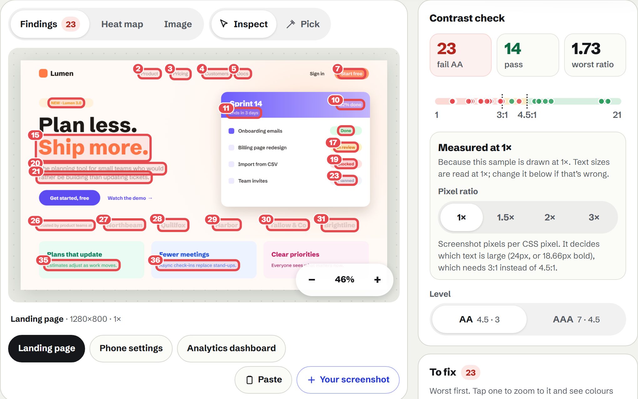
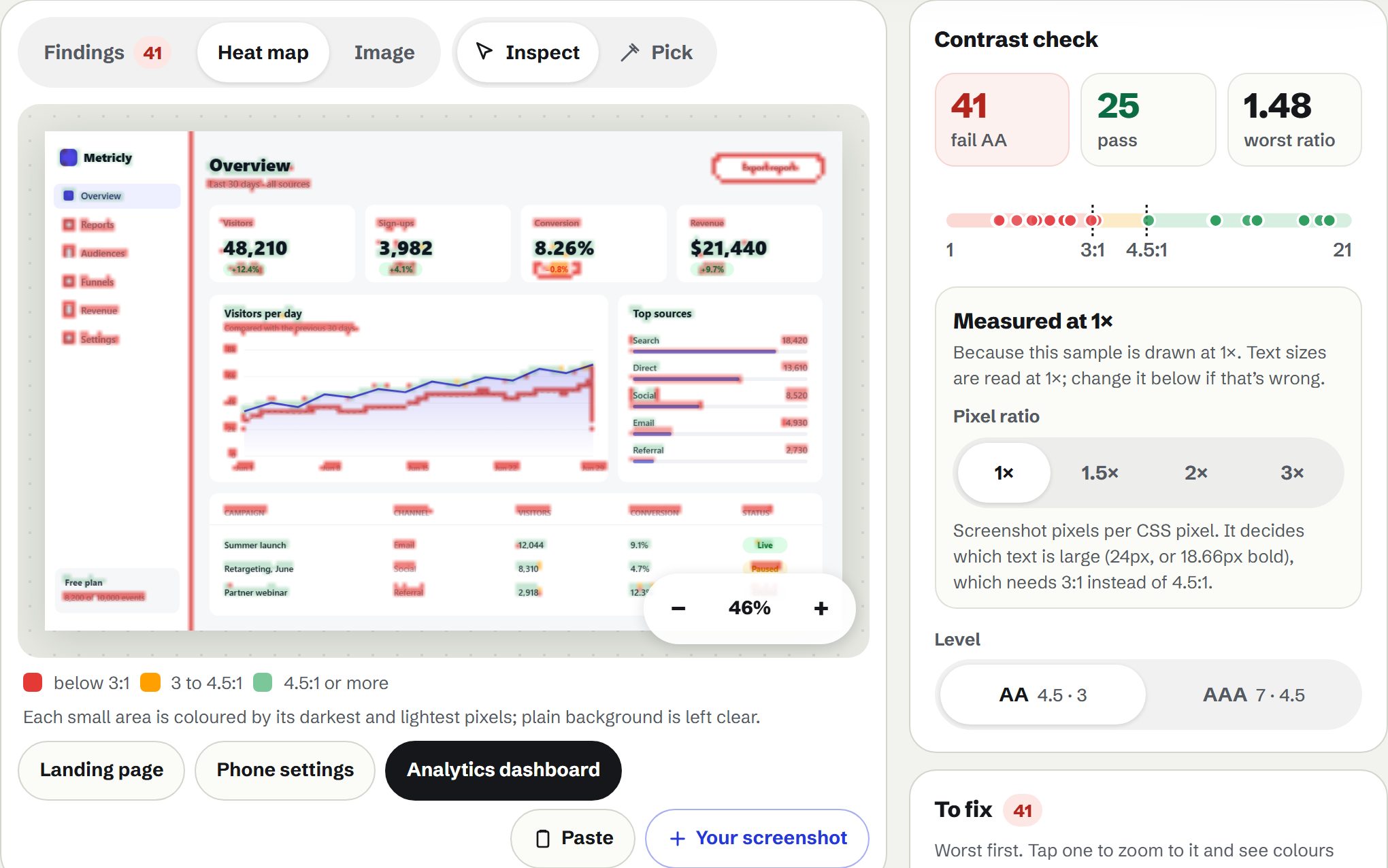
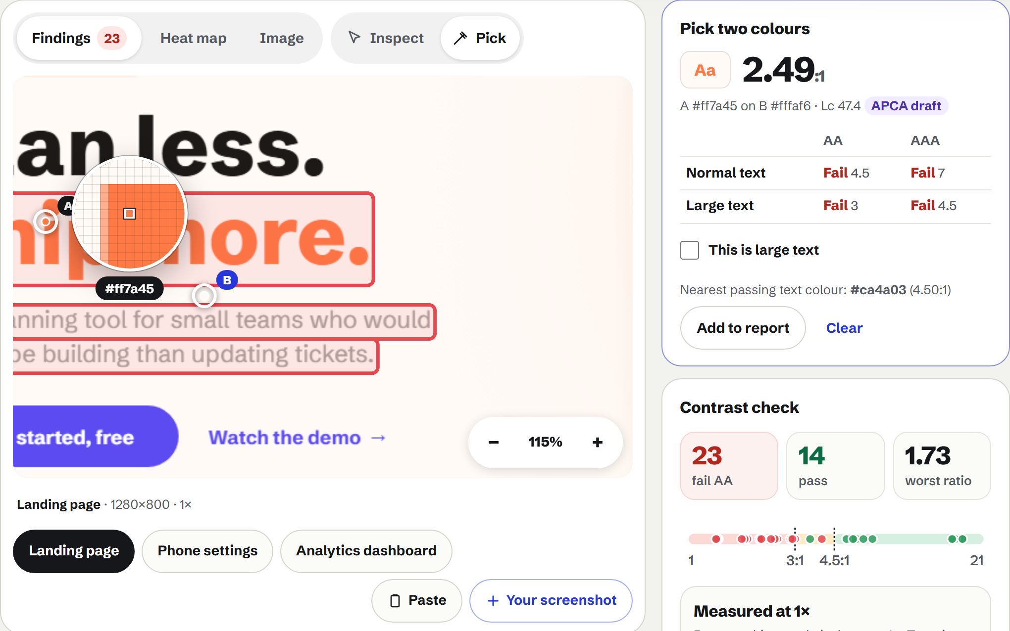
Drop a screenshot of a design and the text in it is found and measured, with each failure numbered on the image and a colour that passes. Pick any two pixels for the exact ratio, or see a heat map of hard-to-read areas.
Runs in this tab. Nothing is uploaded. Keeps working if your connection drops.
Drop a screenshot or designor click to choose one, or paste with Ctrl+V (⌘V). It stays on your device.
Or try a sample
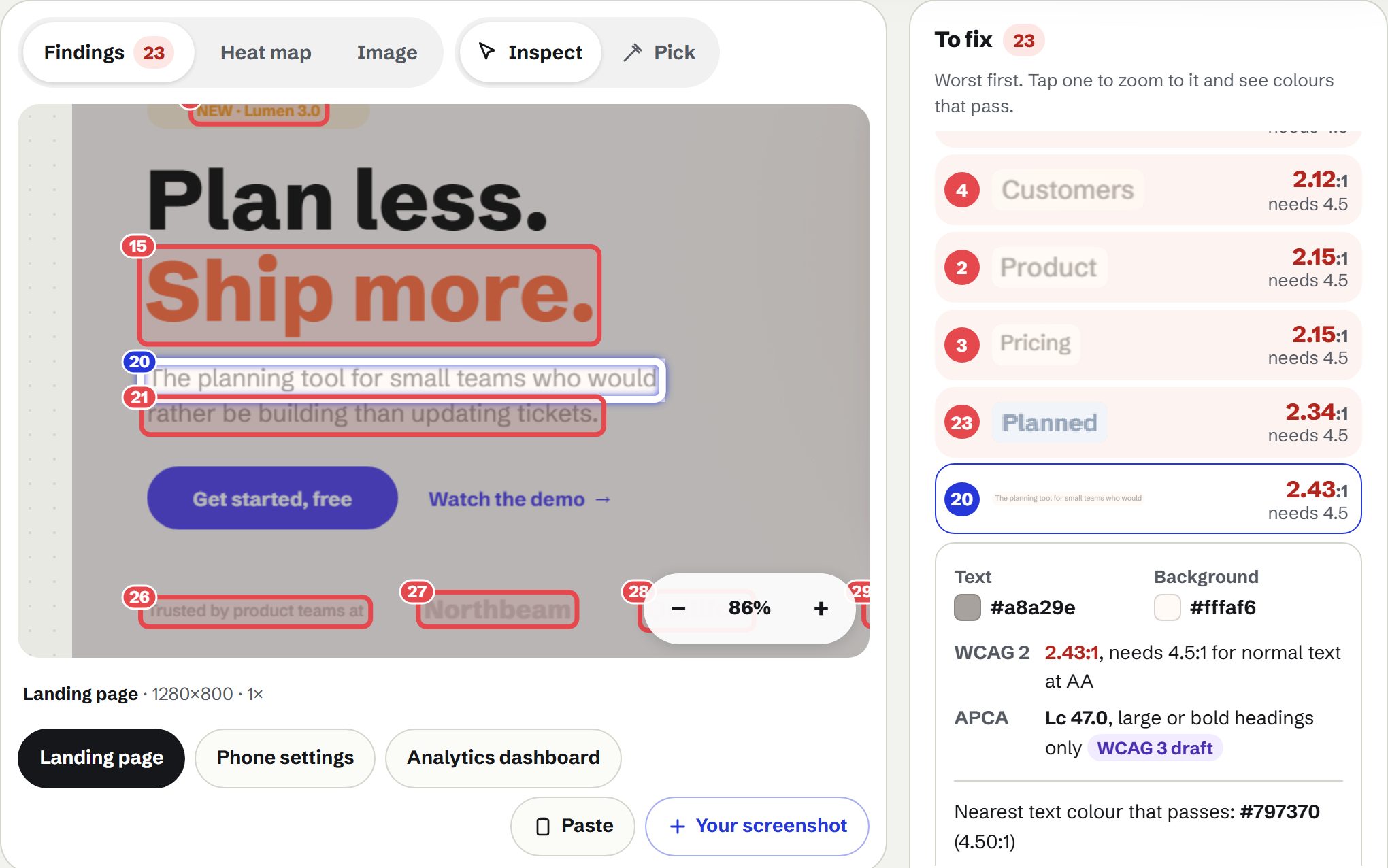
- Finds the text for youEvery text-like area is found and measured, and the ones that fail are listed worst first, each with its ratio and a close-up.
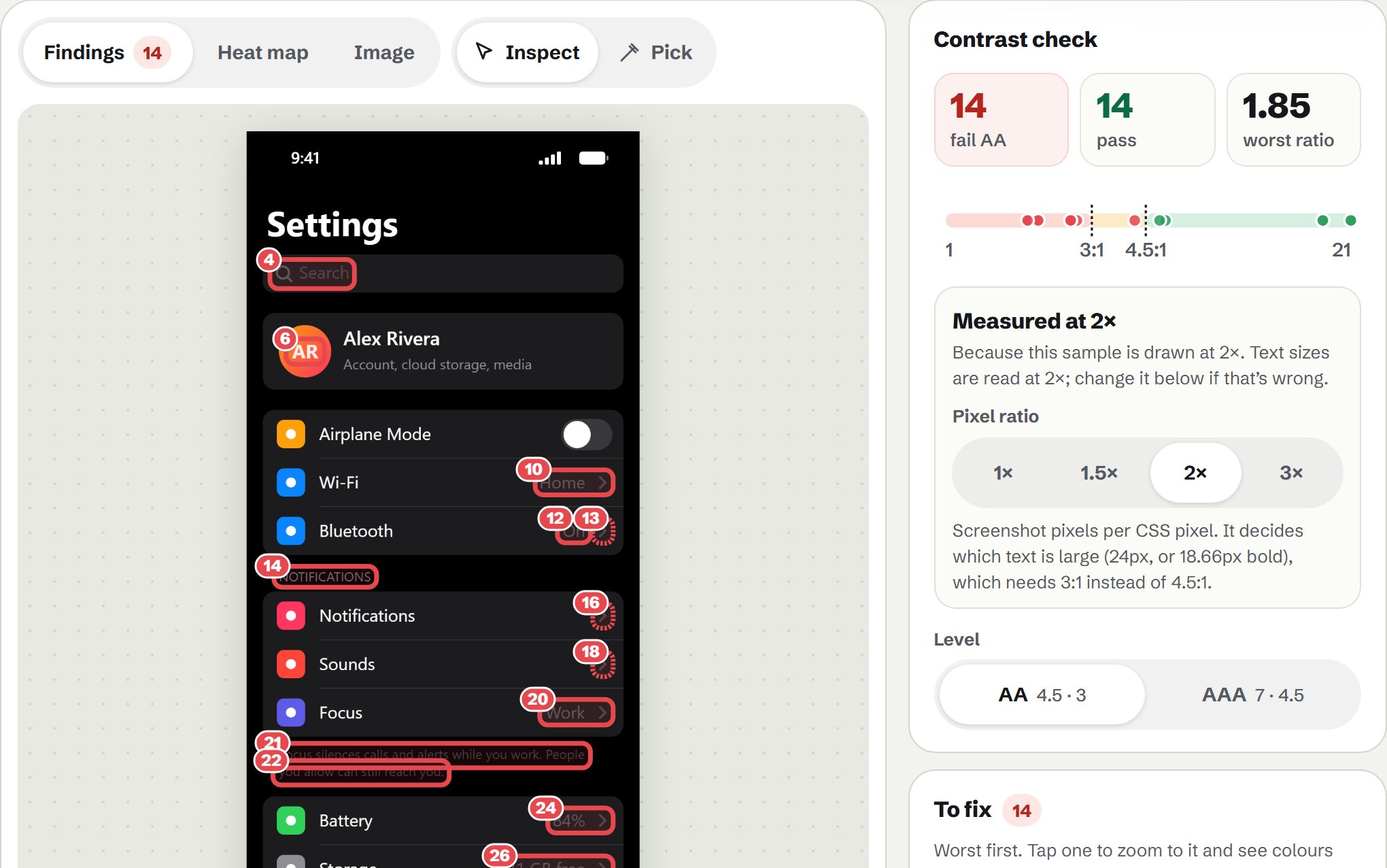
- Exact WCAG thresholdsAA needs 4.5:1, or 3:1 for large text; AAA needs 7:1 and 4.5:1; icons need 3:1. The pixel ratio (1×, 2×, 3×) is worked out from the image, so text sizes come out right.
- A colour that passesFor each failure, the nearest text colour that reaches the ratio, keeping its hue and as much of its colour as possible, or a background that works instead, previewed on the real screenshot.
- Pick any two pointsZoom in, use the magnifier to hit single pixels, and read the WCAG 2 ratio beside the APCA score from the WCAG 3 draft.
PNG, JPEG, WebP, GIF (first frame), AVIF or SVG. Every pixel is measured, up to 48 million (a 1440 × 33,000 full-page capture). Text is found from the pixels: icons are marked as graphics, and text over photos can be missed, so pick those by hand. JPEG blurs thin text, so close calls in a JPEG are marked Check. Transparent areas are measured on white. Nothing is uploaded.